
Square Internship
UI/UX of Square Products
Redefining the User Experience of Square Products
Internship Experience
In the summer of 2018, I did a 12 weeks internship with Square in San Francisco. It gave me an experience of working on a wide variety of projects ranging from designing a complete new keyboard for their new Square Terminal along with exploring and re-envisioning the ‘Tutorial’ feature for their main Point of Sale app. I also did some User Experience design work for their upcoming hardware products (NOT shared here due to project confidentiality). Below is a snapshot of the other projects done during the internship.
CATEGORIES
User Interface / User Experience
ROLE
Product Design Intern
Manager
Mark Grossman, Brian Stegall
Design Brief 1:
Design a tutorial which helps merchants to customize the payment flow to best suit their business
The existing Square Point of Sale app had few on-boarding tutorials which helped the users to learn how to do tasks like - Accepting Payments and Issuing a Refund. However, there was a need of adding more tutorial topics to the On-boarding feature. The current style used the hand holding format to guide the user through a task. But the same was not applicable for other tasks like - Customizing the checkout flow of the device.
Current Tutorial Style
The current payment flow needed the merchant to go through many layers in the setting tree to choose from four set of options. This non linear task flow made it difficult to follow the hand holding format. Moreover, the setting terminologies like ‘Customer Checkout Screen’, ‘Standard Checkout Screen’ etc were not very clear to a first time user.
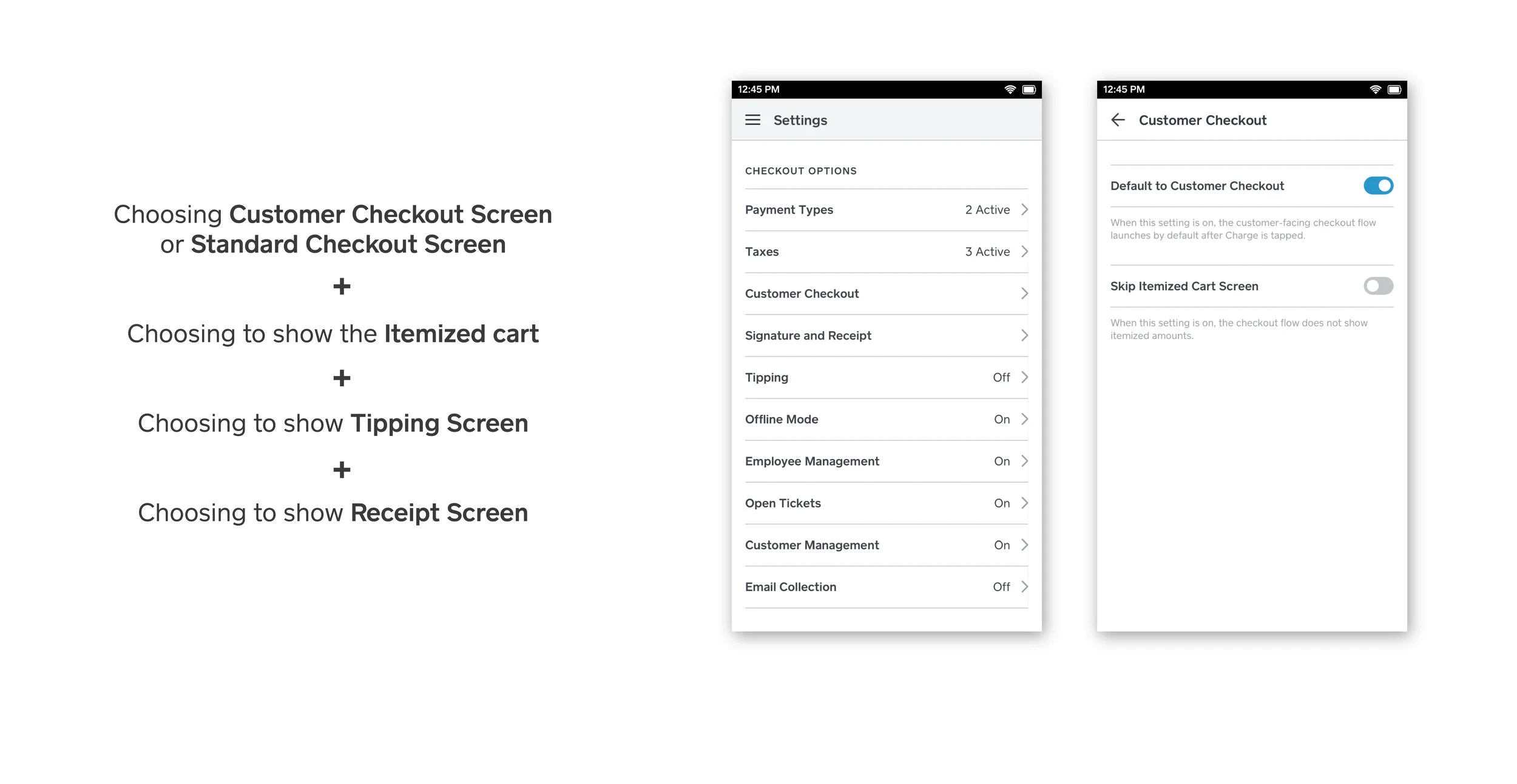
Proposed Solution
The new direction proposed a dedicated section in the Tutorials tab that could help the merchants achieve their goal in one linear flow. We also proposed to have more visuals to help the merchants understand what each terminology meant and looked in the payment flow.


Advantages
This new format provided a clear understanding to the merchants of the terminologies of the various screens involved in the checkout process
They could get a visual preview of the flow at the time of selecting the screens, instead of waiting to see it on a real transaction.
Simplification of the choosing process with the usage of only radio buttons, instead of a mix of various elements.
Having all tutorials at one place, making it convenient to visit later if needed.
Design Brief 2:
Designing a new keyboard for Square Terminal in alignment with the design language developed for Square Register.

Design Challenges
The Square Register boasts of a massive 13” static screen which enriches the keyboard with comfortable real estate. Whereas, the Square terminal had a much smaller screen with hand held usage, making it difficult to adapt the keyboard design language on the smaller device.
Landscape format of the Register vs the Portrait format of the Terminal.
Scalable design to adapt to multiple languages for international market.

Initial Explorations

Final Screens

Rough concept wireframes

Internship Highlights
I was able to work directly with developers and was able to get the Keyboard feature into development during my tenure.
I got a wholistic experience of working on 2 UI based projects and 1 big UX Project (not shown here) during my internship.
Apart from work, I had a great time exploring the West coast and in the process, made some great friends and memories.