
Reflect - Digital conversation cards
How can we ease conversations around health and make them more meaningful for patients and their supporters?
Summary
Reflect is a game-like conversation app that provides a playful platform for patients and their supporters to engage in meaningful conversations around health. It provides them a template to ask sensitive but important questions to make better health decisions. It also helps them set up goals and co-work as a team in overcoming their challenges.
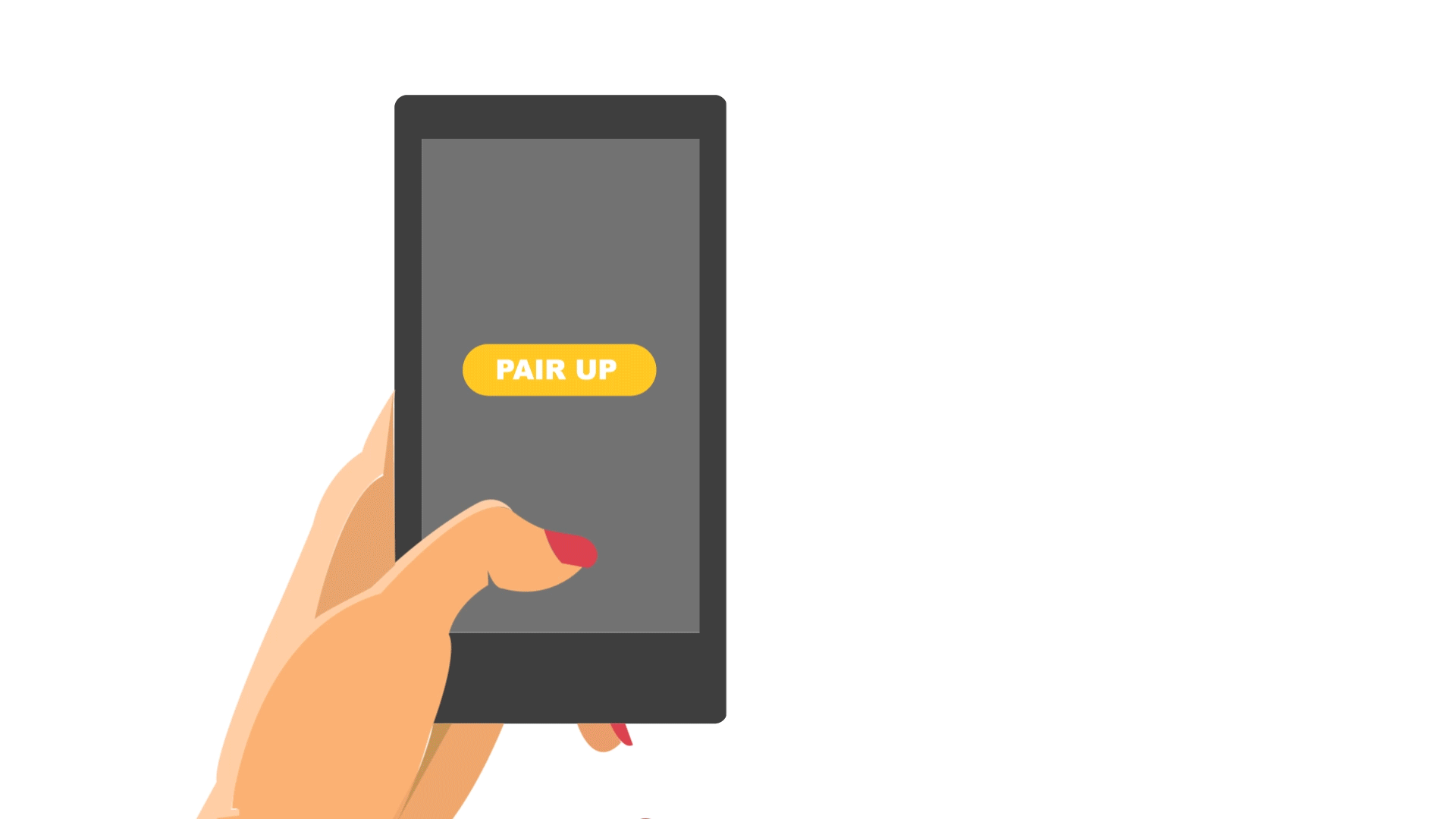
The game can only be played when the two phones are brought together creating a combined screen. The key interaction recreates the charm of a board game and encourages dialogue through in-person interaction.
ROLE
Research, Ideation, Storyboarding, Low Fidelity Prototyping, Visual Illustrations, Concept Video, Wireframes
COLLABORATORS
Rachel Balma, Kinza Kasher, Glenda Capdeville
Advisors
Aashika Jain (Doblin- Deloitte), Criswell Lappin (Scrollmotion), Roger Mader (Ampersand)
CONCEPT VIDEO

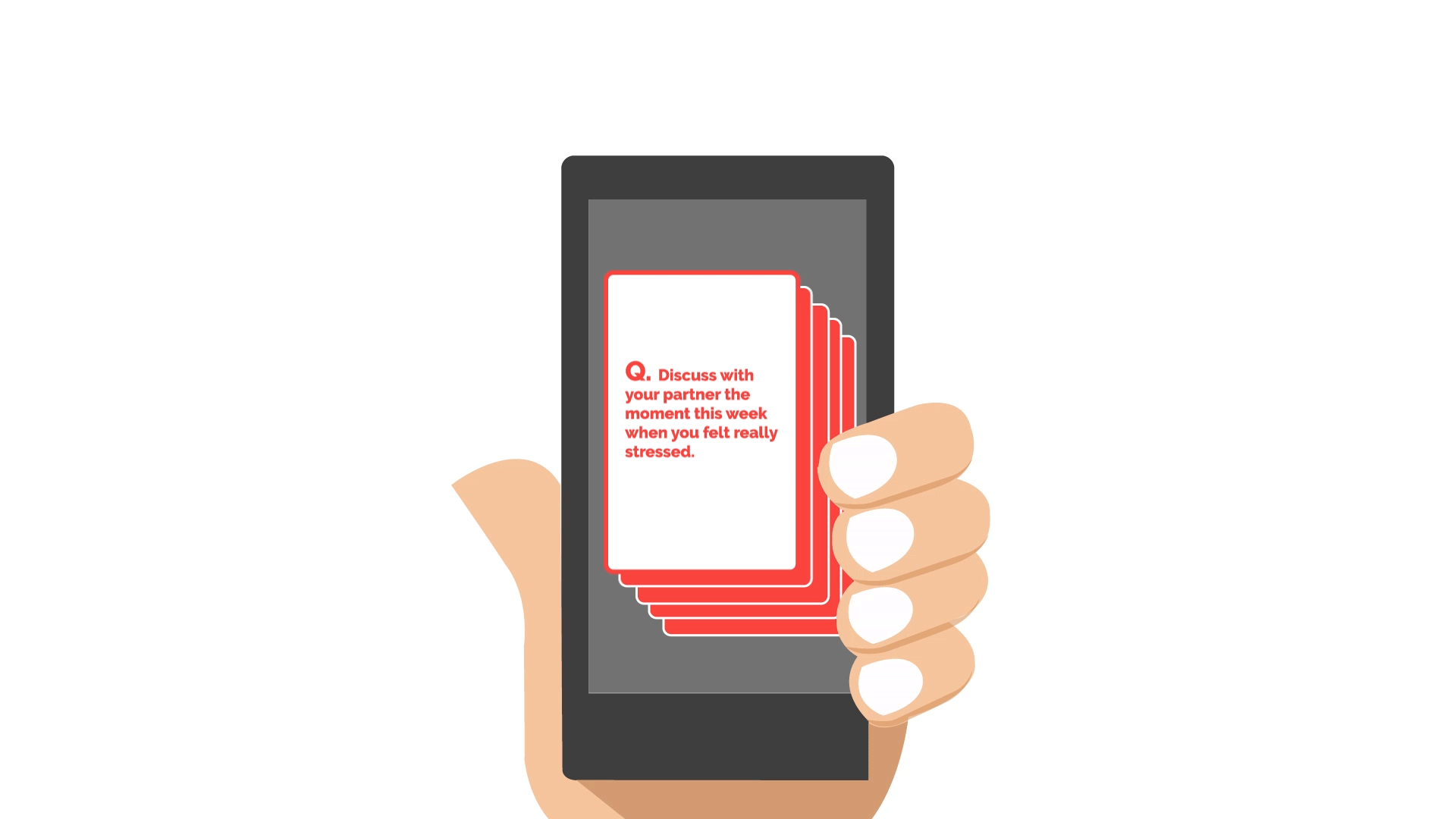
The app is designed to be a medium to encourage meaningful conversations between patients and supporters in a delightful way. The interface is unique which allows the players to combine the display of their phones with a swipe of a finger. The players can then choose the conversation themes from the various topics related to health. Post which the app generates a mix of cards that can be shuffled by the players on the combined screen. They pick one card for themselves and one for their partner to engage in meaningful conversations. Post discussion, the app gives the players the opportunity to take notes, set goals or reminders from the new learnings that they gathered from the game.
KEY FEATURES


We followed the 4D (Define - Discover - Design - Deploy) approach for our design process. This helped us to structure the project into well defined phases and dive deeper into each to explore various tools and methodologies. The project was completed in a span of 10 weeks and in the end we presented our solution in the form of a MVP (Minimum Viable Product) to our sponsors and fellow classmates.
PROCESS

We did extensive desk research and conducted in depth user interviews with eight patients and their supporters to closely understand their challenges and motivations. These structured qualitative interviews helped us see common patterns in their experiences and better understand their obstacles.
RESEARCH

All our observations from the interviews were later grouped under common themes to identify patterns and see the bigger picture. This became our raw material in finding insights which further led us to frame design principles.
Observation Clustering

Group brainstorming helped us to convert the design principles into opportunities for intervention. We further came up with a pool of concepts to address the problems. And in the end we decided to continue in a direction that focussed on the emotional support that patients got from their loved ones. This not only gave them the courage to fight any obstacle, but also empowered them to face the difficult situation boldly as a team.
Synthesis
The observations were then synthesized into insights, giving way to design principles, opportunities and design concepts.
We made a storyboard of our concept in the form of a video and used animations to communicate our key micro-interactions. The animations helped our target group to visualize and understand the context and evaluate if it added any value in their lives. We also made some physical paper cards to simulate the playing experience and recorded the observations.
STORY BOARD

We focussed on the micro-interaction because it created an aha moment of joy in the experience of playing the game. The users had not experienced anything like this before. The shuffling of cards by bringing the phones together to create a joint screen can be done by using Pinch - (a multi display application) to dynamically sync the content on both devices. The same element is used again when the players choose one card for themselves and one for their partners. More about Pinch here.
MICRO-INTERACTION
These storyboards and animations were used for our second round of user testing with our research participants. In this round, we wanted to probe what kind of information sharing was helpful to both the patients and the caregivers. This helped us to formulate the content of the communication cards.
Our takeaway from the project was that patients do not just want assistance in their health care management, rather they want to be well understood by their loved ones so that they are empowered and can fight the challenge in a more effective manner.
USER TESTING

To design the user experience we needed to understand the entire process from the key stakeholders’ point of view. This was done by breaking the experience into 5 stages and analyzing them from different lenses. By carefully understanding user’s thought, feeling and actions throughout these stages, we were able to empathize and better design the new experience.
User Experience (5E Analysis)

We broke down our user’s journey with the app in those similar buckets to make sure that we design for the full range of the experience. It also helped us to organize the information architecture of the app and not miss any key moment of interaction.
APP USER JOURNEY
The rough structure of the app was drawn into wireframes to evaluate the flow and identify missing links. This proved extremely helpful before we could further crystalize it into high fidelity screens.
WIREFRAMES

The project helped me understand and apply the various tools used in a design process.
It challenged me to work together in a varied group and leverage on each other’s strengths.
I also learnt some software tools like After Effects, Premiere and Sketch.
The most important learning came from interacting with people who were facing this real life challenge. It gave me a big reason to make something that added true value to their lives.
